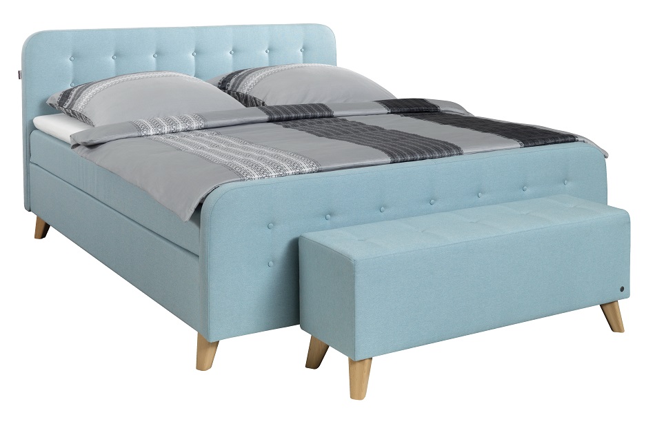
COLOUR is serious business for the Pantone Color Institute — the authority on colour and provider of colour systems — which practices the annual ritual of informing the world about the “Colour of the Year”. It is more than just predicting what shade will be trendy — for the colour experts, it’s a symbolic selection, a hue that reflects the mood and attitude of the moment.
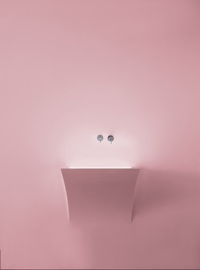
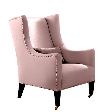
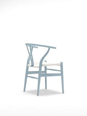
This year, Pantone announced two colours — a warm rose hue and a cooler, tranquil blue. According to a press release, the Rose Quartz (Pantone 13-1520) is a persuasive yet gentle tone that conveys compassion and a sense of composure while Serenity (Pantone 15-3919) is weightless and airy, like the expanse of the bringing feelings of respite and relaxation even in turbulent times.
It sounds as if Pantone has prescribed the best colour remedy to what most of us suspect might just be a challenging year ahead. These two shades can stand alone or blend together beautifully, and in either way project a sense of wellness, order and peace.
According to Pantone Color Institute executive director Leatrice Eiseman, the colour duet also represents something bigger and challenges traditional perceptions of colour association. She said in a statement, “In many parts of the world we are experiencing a gender blur as it relates to fashion, which has in turn impacted colour trends throughout all other areas of design. This more unilateral approach to colour is coinciding with societal movements towards gender equality and fluidity, the consumer’s increased comfort using colour as a form of expression, a generation that has less concern with using colour as a form of expression, a generation that has less concern about being typecast or judged and an open exchange of digital information that has opened our eyes to different approaches to colour usage.”
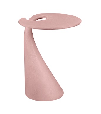
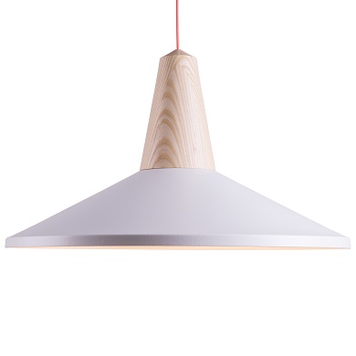
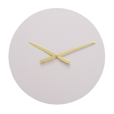
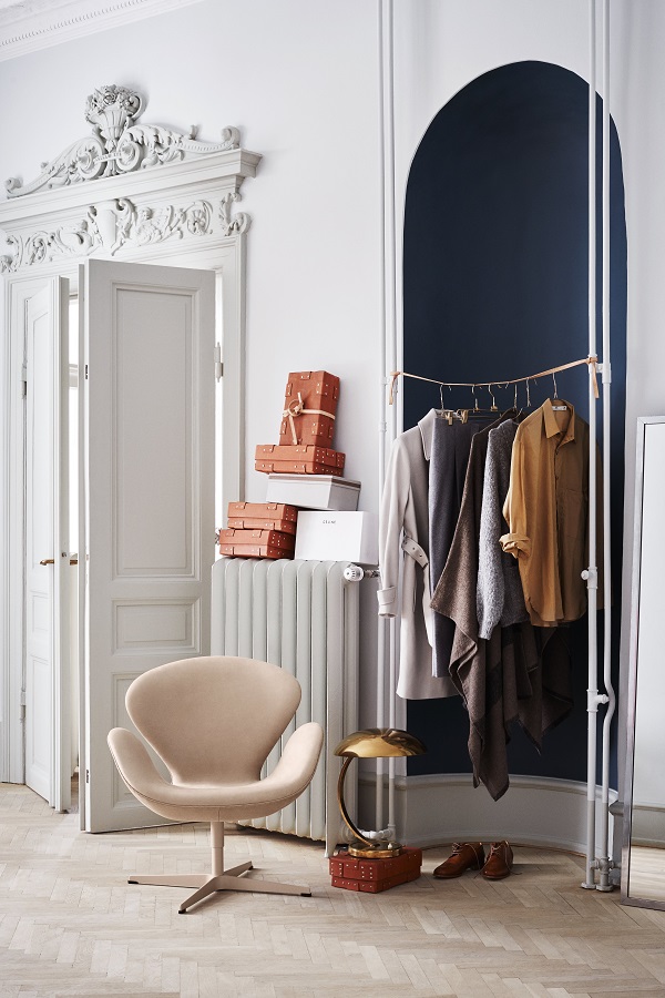
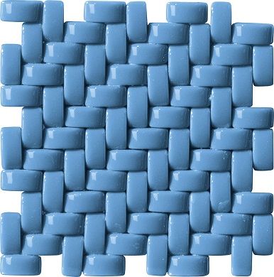
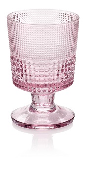
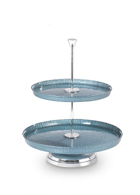
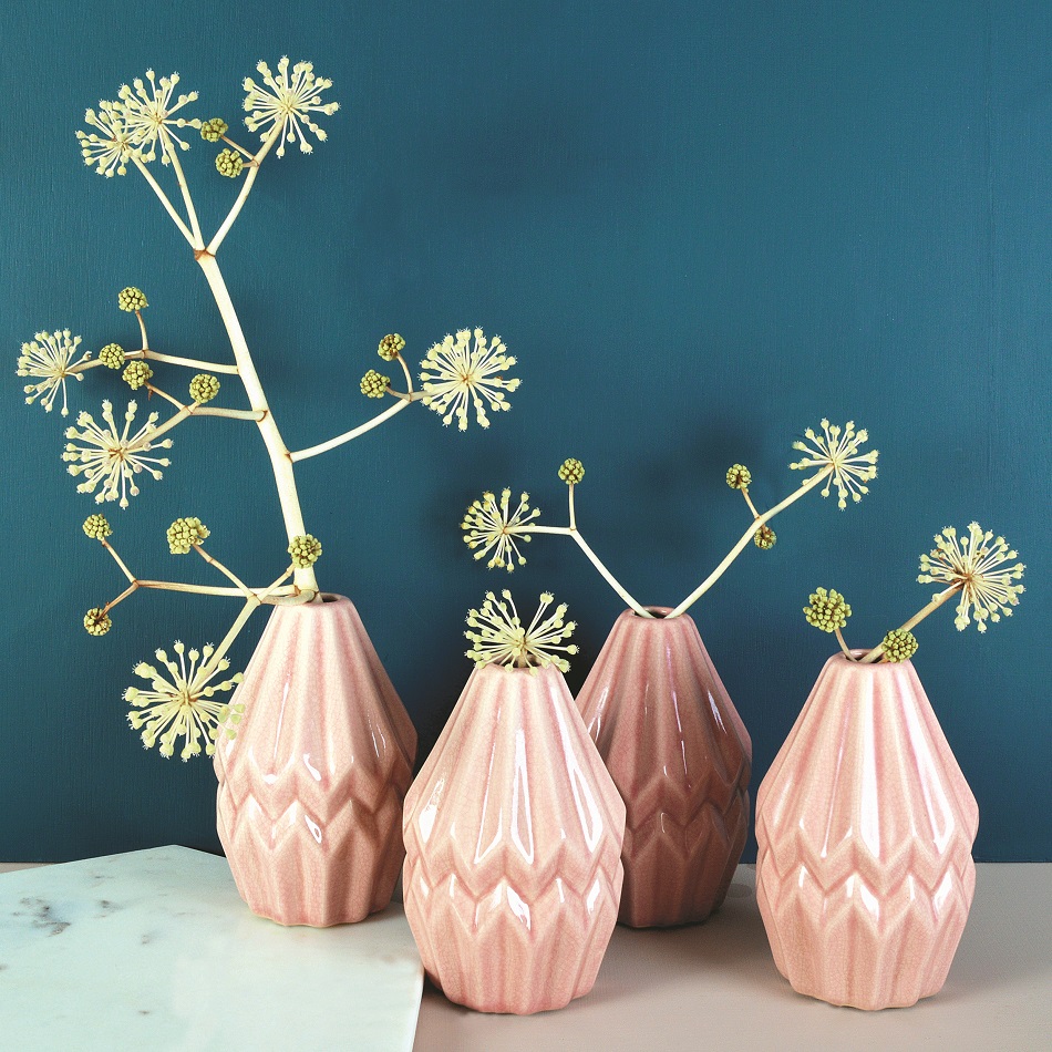
In a time when calm, reassurance, security, order and peace are sometimes a tall order, Rose Quartz and Serenity make for perfect allies in the home. No need for a major overhaul — there are easy yet elegant ways to incorporate the two hues in your décor scheme. We shopped around the world for these chic finds to help spruce up your space.
Start your search for a condominium of your choice HERE.
This article first appeared in the February 2016 + March 2016 issue of Haven, which comes complimentary with The Edge Malaysia Weekly. Subscribe here for your personal copy.
TOP PICKS BY EDGEPROP
Rumah Selangorku De Kiara
Setia Alam/Alam Nusantara, Selangor





hero.jpg?GPem8xdIFjEDnmfAHjnS.4wbzvW8BrWw)


